


Canvas prints have become a staple in modern home décor, adorning everything from sleek apartments to cozy homes. These versatile pieces are loved by art enthusiasts, interior designers, and anyone wanting to add a personal touch to their walls. Two styles are currently trending—muted monochrome and high-contrast art.
What Defines Muted Monochrome?
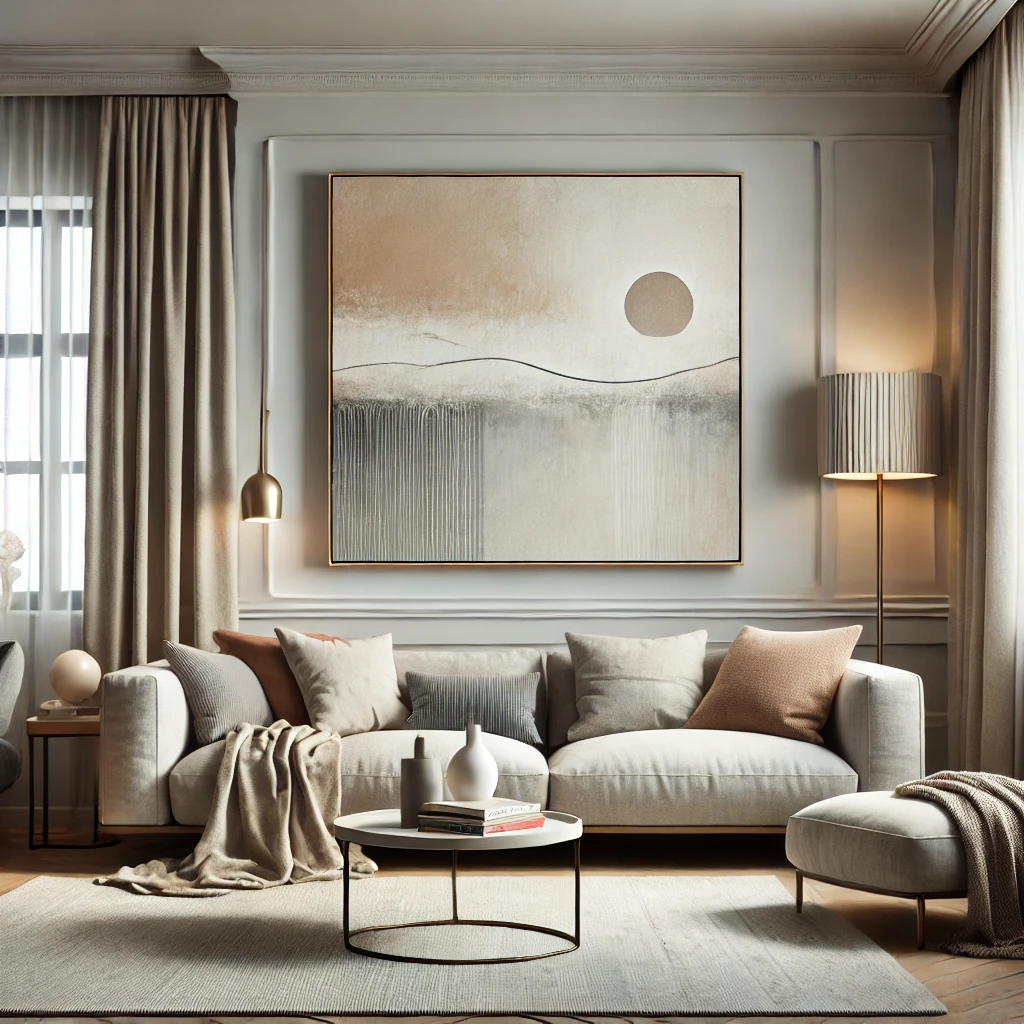
Muted monochrome canvas prints are the calm, collected sibling in the world of wall art. Think subtle neutral tones and minimalist charm. These artworks often feature a limited color palette—soft grays, off-whites, taupes, and blacks—that work together harmoniously for a subdued yet stylish look.
Why Everyone Loves Muted Monochrome
Muted monochrome art is all about creating a sophisticated and timeless atmosphere. Imagine walking into a space that instantly feels calm, like wrapping yourself in a cozy blanket of tranquility. Whether it's a soft abstract print or minimalist botanical sketches, muted monochrome has an understated elegance that never feels overbearing.
This style thrives in environments that lean towards Scandinavian design or minimalist interiors. Picture your favorite cozy café with a minimalist vibe—it probably has muted monochrome framed prints hanging on its walls. These pieces are ideal for creating spaces that are serene and cohesive, making them perfect for bedrooms, offices, or zen corners.
Where Muted Monochrome Shines
- Spaces with natural lighting that enhances its subtle tones.
- Scandinavian aesthetics—think simple, clean, and cozy.
- Neutral interiors that need an extra touch of elegance.
Understanding High-Contrast Art
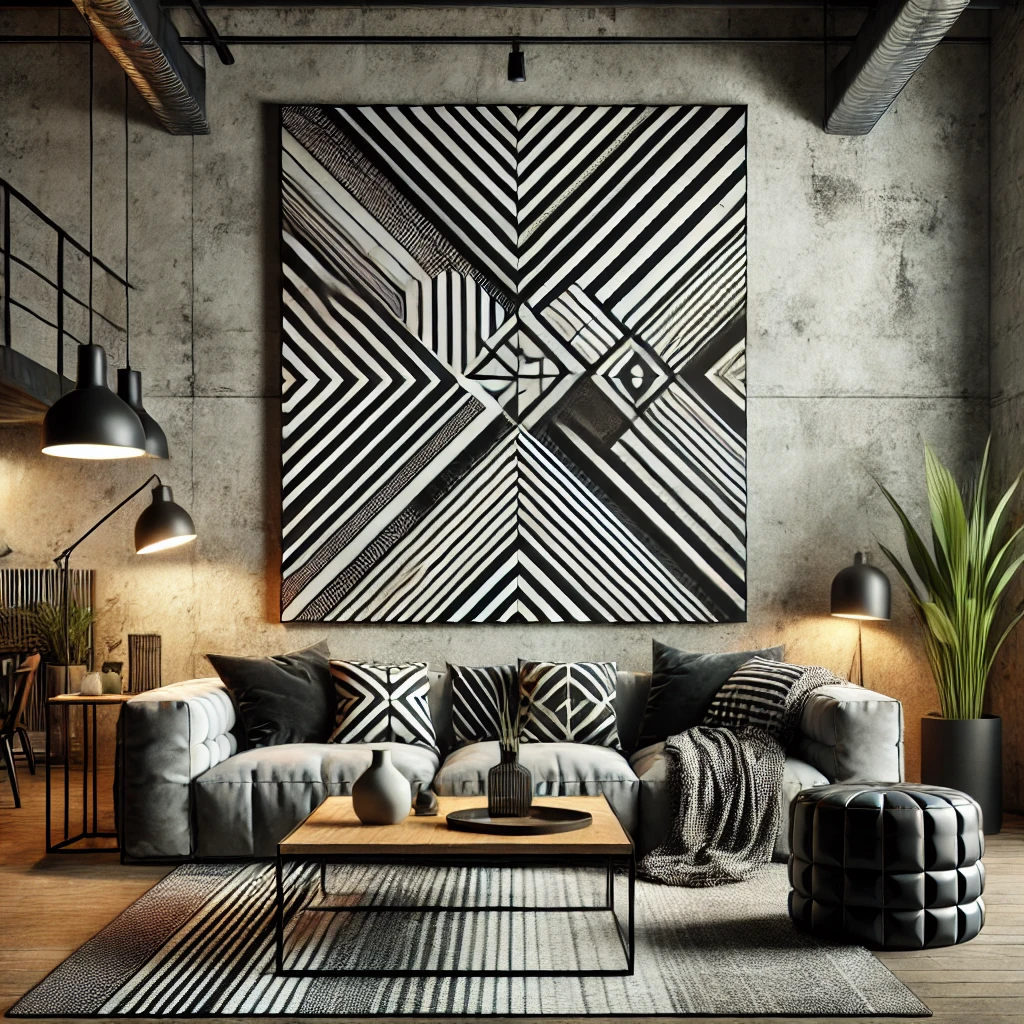
On the other end of the spectrum, we have high-contrast art—the bold, daring, attention-grabbing cousin of muted monochrome. It’s all about striking colors, sharp differences in tone, and dramatic details. These pieces aren’t whispering—oh no, they’re unapologetically shouting, “Look at me!”
Why High-Contrast Art Turns Heads
High-contrast canvas prints inject energy into any space. Their bold hues and visual intensity demand attention, making them the centerpiece of any room. Whether it's a cluster of abstract shapes in red and yellow or a pop-art inspired portrait, this style thrives on flamboyant individuality.
This style shines in eclectic décor, contemporary spaces, or even gallery-like interiors where big statements are encouraged. If muted monochrome is a soothing cup of chamomile tea, high-contrast art is an espresso shot that wakes up your room—vibrant, dynamic, and utterly unforgettable.
Where High-Contrast Prints Dominate
- Modern interiors looking for a dramatic focal point.
- Spaces with minimal distractions, so the art remains the star of the show.
- Creative, quirky environments where bold self-expression is welcome.
The Emotional and Visual Impact
Muted monochrome and high-contrast art don’t just change your room’s look—they alter its mood. The emotional response tied to each style couldn’t be more different.
- Muted monochrome creates serenity, calm, and sophistication. It’s the visual equivalent of a deep exhale. Perfect for spaces where you want to wind down after a long day.
- High-contrast art, on the other hand, adds energy, vibrancy, and excitement. It’s the shot of adrenaline your space might need to feel alive and thriving.
Consider how the colors and tones in your canvas prints influence your daily life. Are you craving a Netflix-worthy cozy space? Or are you ready to energize your interior like an art gallery that came to life?
Personalizing Your Choice
Choosing between muted monochrome and high-contrast wall art isn’t just about aesthetic preferences—it’s about how you want to feel in your space. Take a minute to reflect:
- What’s your current room décor? Is there a theme the art needs to match? Or is the art going to set a new tone?
- How’s the lighting? High-contrast art pops in well-lit rooms, while muted monochrome works wonders in softer lighting.
- Room size matters. Muted tones can make small spaces feel more expansive, while bold art can overpower cramped rooms.
Mixing and Matching
Who says you can’t have it all? These two trends can coexist harmoniously with a little creativity. For example:
- Pair muted monochrome canvas wall art with a bold rug or furniture accent to keep the overall vibe balanced.
- Use high-contrast art as the centerpiece and complement it with muted monochrome pieces to create a curated gallery wall.
Blending the best of both worlds lets you play with contrast and cohesion, ensuring your walls are more conversation-starters than art.
Trends and Longevity
Muted monochrome and high-contrast art both hold a timeless appeal. Monochrome pieces remain a staple in minimalist and classic designs, while high-contrast art captures the daring spirit of modern creativity.
Currently, muted monochrome appears to dominate Instagram feeds, thanks to its compatibility with trending neutral palettes in fashion and interior design. Meanwhile, high-contrast art is enjoying a renaissance in spaces that prioritize bold self-expression, such as urban lofts and creative studios.
Conclusion
Whether you’re drawn to the calming elegance of muted monochrome or the bold energy of high-contrast art, your choice reflects your personality and the atmosphere you want to create. These styles go beyond décor—they express mood, taste, and individuality.
Understanding their emotional and visual impact helps you create a space that feels uniquely yours. Feeling adventurous? Blend the two for a striking, balanced design. Your walls can be more than a backdrop—they can showcase your creativity and self-expression.