


Muted pastels and soft gradients are having a moment, and we love them. These gentle hues and smooth transitions are transforming modern art, replacing bold with serene and loud with calming.
If you’ve been on Instagram or checked out trendy canvas prints, you’ve likely seen this dreamy aesthetic everywhere—from wall art to branding.
But why are muted pastels and soft gradients so popular right now? What makes them so appealing? Stick around, and we’ll break it down.
What Are Muted Pastels and Soft Gradients?
Muted pastels are the delicate, toned-down cousins of the brighter pastel shades you’re used to seeing—think dusty pinks, cool sages, and soft blues with a whisper of gray. Soft gradients, on the other hand, are those smooth, transitioning color blends that feel fluid and almost hypnotic—picture a sunset dissolving across the sky.
Together, these color and design elements have created a new wave in modern art. They’re calm, they’re chic, and they’re refreshingly anti-chaos (something we could all use a little more of in today’s world, right?). This aesthetic has seeped into everything from canvas wall art to packaging design and interior decor, creating a vibe that feels cozy and contemporary.
The Bigger Picture
This rise in muted pastels and soft gradients is no fluke. It reflects a broader cultural pivot toward minimalism, mindfulness, and comfort in our homes and lifestyles. Art is, after all, a mirror of the times, and this aesthetic speaks to our collective craving for peace and simplicity.
The Origins of the Gentle Aesthetic
A Nod to History
Muted tones take us back to art movements like Impressionism and Romanticism, where softer palettes dominated the narrative. Artists like Turner and Monet had an eye for those hazy hues that evoked quiet beauty. Fast forward a few decades, and minimalism made us fall in love with simplicity all over again.
Minimalism Meets Soft Abstraction
Minimalism sliced away the excess, while abstraction allowed for experimentation. Combine the two, and you get modern artists who’ve embraced soft palettes and gradients as a way to express complexity without overwhelming the viewer. It’s art that whispers instead of shouting—a refreshing break from the visual clutter of the digital age.
From gallery walls to digital canvas prints, early adopters of this trend have paved the way for a movement that feels grounding yet effortlessly stylish.
The Psychology of Muted Colors and Soft Gradients
What’s so irresistibly calming about muted colors? Why do soft gradients make us want to stare at our walls for hours?
Calm and Serenity in Every Swatch
Muted pastels are not only easy on the eyes but also gentle on the mind. These subdued tones evoke feelings of relaxation, security, and balance, making them ideal for art, canvas prints, and home decor in today’s overstimulating world.
Gradients and Emotional Flow
Gradients feel like a visual sigh of relief. They offer fluid transitions that mirror the ebb and flow of life itself, creating a sense of harmony, as if everything is naturally falling into place. Combined, muted colors and gradients tap into the growing desire for spaces and art that soothe rather than distract.
Art Meets Mental Wellness
During a time when mental health is at the forefront of cultural conversations, these aesthetics are more than just pretty pictures. They tie into the art of mindfulness, turning your space into a sanctuary. Wall art with muted tones or gradient designs can change the whole vibe of a room, bringing a sense of calm that’s good for the soul.
Technology's Role in Popularizing the Aesthetic
Digital Tools and Creativity
- Platforms like Adobe Illustrator and Procreate have revolutionized the way artists create.
- Soft gradients and muted tones are now easier to design and refine with digital tools.
- These tools provide endless precision and creative possibilities, adding new depth to this aesthetic.
Social Media’s Amplifying Effect
- Instagram, Pinterest, and other platforms have propelled minimalist design trends to global popularity.
- Influencers share tranquil decor featuring this aesthetic, while brands use it in packaging designs.
- The gentle, calming vibe of this trend resonates across social feeds, spreading its influence quickly.
Printing That Brings Designs to Life
- Advances in printing technology ensure gradients and muted tones maintain their visual impact.
- High-quality printing allows these designs to transition beautifully from screens to canvases.
- This evolution brings the aesthetic into physical spaces, making it more accessible and tangible.
Beyond Traditional Art
Muted pastels and soft gradients have crossed over into branding, fashion, and interior design.
Branding
Ever noticed how “cool and calm” brands like wellness apps, coffee shops, and eco-friendly products often gravitate toward muted tones? It’s no coincidence. This aesthetic has become shorthand for trust, tranquility, and modernity.
Fashion
Soft-toned outfits and flowing gradient scarves have taken over runways and retail stores alike, proving once again that art transcends the canvas.
Home Decor
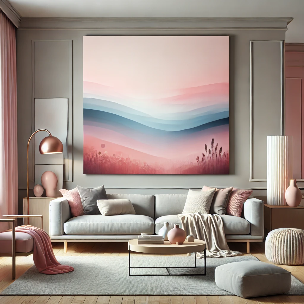
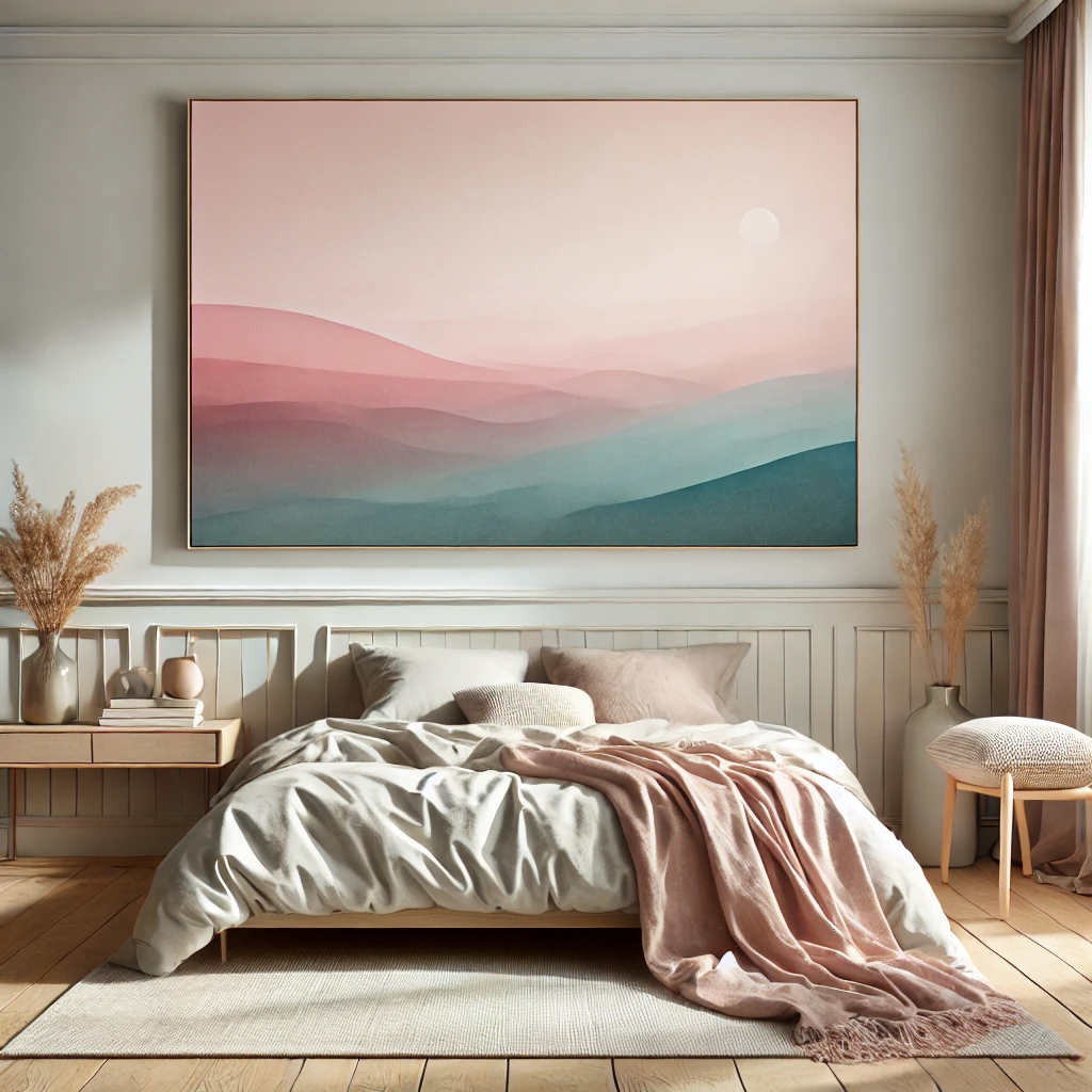
Canvas wall art featuring muted colors and gradients is a must-have for anyone looking to create a cozy yet contemporary vibe in their space.
Conclusion
The gentle aesthetic—with its muted pastels, soft gradients, and calming vibes—offers a soothing escape from the chaos of modern life. Through art, design, branding, and fashion, it invites us to pause and enjoy moments of calm.
Its timeless, adaptable nature ensures it will evolve, blending innovation with tranquility to remain relevant. By embracing this aesthetic, we’re not just following a trend but creating spaces that reflect our need for balance and mindfulness in an overstimulating world.