
The Perfect Color Palette: Matching Canvas Prints to Your Interior Design
Canvas prints are a versatile and stylish way to personalize your space. However, selecting the right prints isn’t just about choosing a beautiful image—it’s also about ensuring the colors harmonize with your interior design. This article explores how to choose a canvas print color palette that complements your decor, enhances your space, and creates the perfect balance between art and ambiance.
Understanding Your Interior Design Color Scheme
The first step in matching canvas prints to your interior design is understanding your existing color scheme. Most interiors fall into one of three categories:
- Neutral tones like beige, white, or gray create a calm, versatile foundation.
- Vivid and colorful palettes that rely on bold and bright shades to energize the space.
- Mixed palettes that combine subtle neutrals with pops of accent colors for balance.
Once you identify your room’s color scheme, you can decide whether to blend your canvas print with the existing tones or use it as a statement piece to create contrast.
Choosing the Right Canvas Print Colors
When selecting a canvas print, think about the relationship between its colors and your room's design. In a space with neutral tones, you might choose prints with vibrant colors to add energy and focus. Conversely, in a colorful room, a more muted or monochromatic print can balance the intensity and prevent visual clutter.
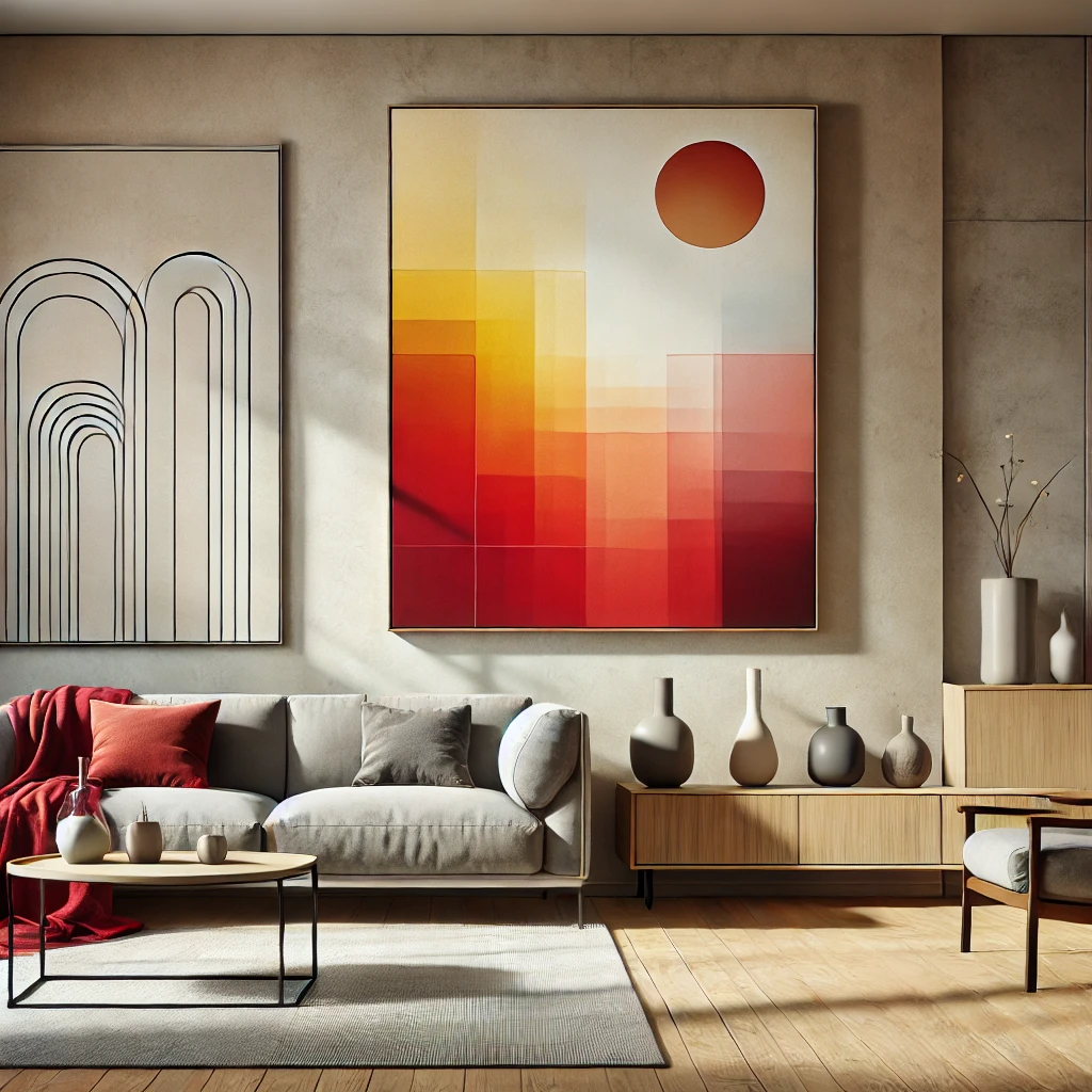
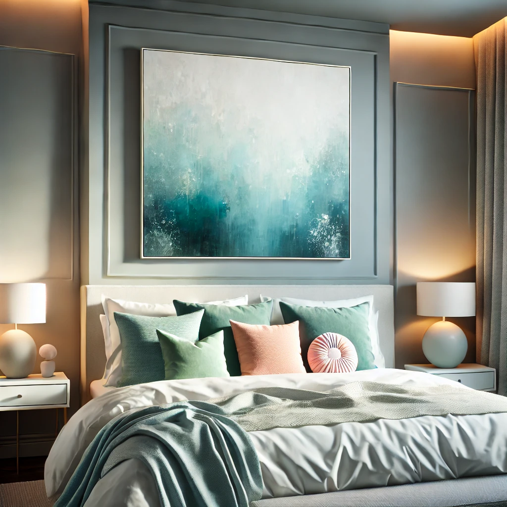
Also, consider the emotions conveyed by certain colors. Warm tones like red, orange, and yellow create a cozy, inviting atmosphere, making them ideal for living rooms and dining areas. Cool tones such as blue and green promote calm and relaxation, perfect for bedrooms or offices. Choosing colors that reflect the mood you want in the room ensures harmony between the print and its surroundings.
Using Canvas Prints to Highlight Interior Features
Canvas prints can do more than match colors—they can emphasize the best features of a room. A bold, oversized print can serve as a focal point, drawing attention to a particular wall or area. Smaller prints in complementary tones can accentuate architectural details, such as alcoves or mantelpieces.
In open spaces, canvas prints can also help define zones. For instance, placing a warm-toned print near a dining table creates a distinct, inviting dining area, while cooler-toned artwork can establish a serene, focused zone in a home office.
Practical Tips for Selecting and Placing Canvas Prints
To ensure your canvas prints complement your space effectively:
- Size Matters: A small print on a large wall may feel out of place, while an oversized print can overwhelm a compact room. Choose dimensions that align with the room's scale.
- Group Prints Thoughtfully: For larger spaces, create a gallery wall using prints with a cohesive theme or color palette. This can make a bold statement while maintaining visual harmony.
- Test Placement: Before committing, use paper cutouts or digital visualization tools to test where prints will look best.
By carefully considering size, grouping, and placement, you can maximize the impact of your canvas prints without disrupting the flow of your space.
Avoiding Common Mistakes
Even with a thoughtful approach, it’s easy to make missteps when incorporating canvas prints into your design. One common mistake is choosing prints that clash with the room's color palette, resulting in a disjointed appearance. Another is overcrowding walls with too many prints, which can make the space feel cluttered and overwhelming.
Additionally, avoid ignoring the room's scale. A large, empty wall requires substantial artwork to feel balanced, while a small nook might be overwhelmed by a massive canvas. Striking the right balance ensures your prints enhance rather than detract from the room's overall design.
Incorporating Seasonal Rotations
One way to keep your space feeling fresh is to rotate canvas prints seasonally. For spring and summer, opt for light, vibrant colors or floral designs that brighten the room. In autumn and winter, earth tones and cozy, textured prints can create warmth and depth. Rotating prints allow you to adapt your decor to the changing seasons, giving your space a renewed look without requiring a complete redesign.
Conclusion
Matching canvas prints to your interior design involves more than just selecting a beautiful image. It requires an understanding of your space’s color scheme, a thoughtful approach to placement, and an eye for how the print complements the room’s features. By considering these factors, you can create a cohesive and inviting environment that reflects your style.